Skip to main content
Search
Search This Blog
slora sauna
PORTFOLIO
SLORA SAUNA RADIO
ABOUT
CONTACT
More…
Posts
Showing posts from 2018
Show All
December 29, 2018
Dissipate
October 04, 2018
Wallow
October 04, 2018
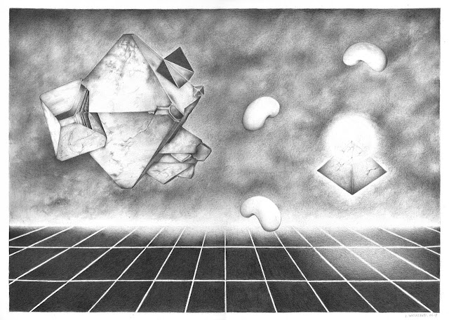
Mineral Dream House
August 04, 2018
Awesome Friends Series
July 10, 2018
Vultures Are Circling
July 09, 2018
Value Study: Major Motoko's Room
July 02, 2018
Anaba
July 01, 2018
Summoning Popcorn
June 12, 2018
Hiros
June 03, 2018
Look Inward, Three Times
June 03, 2018
Festival Ini Cerita Kita
June 01, 2018
Cerita Suka Ria Remaja - Pamflet
March 31, 2018
Poppy Lissiman Cloth Competition Entry
March 17, 2018
Hardwired
January 17, 2018
Dreaming of 98,84,0,0
January 01, 2018
W for Will Byers
Newer Posts
Older Posts
Home